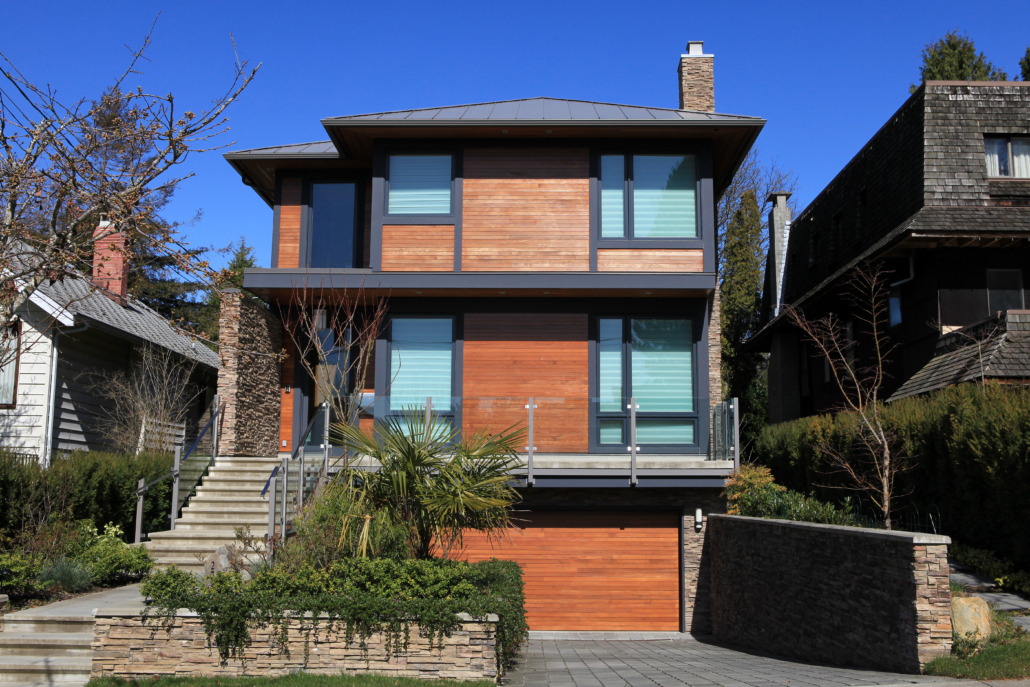
Windows for a Home Addition That Doesn’t Look Bolted On
You can usually spot an addition from the street. Not because the roofline is wrong or the siding doesn’t match. It’s the windows. A newer section with slightly different proportions, a different frame colour, sightlines that don’t quite align with the original house. The addition reads as an addition, even when everything else about the build was done well.
This is one of the most common ways a renovation gives itself away, and it’s almost entirely avoidable with planning at the window selection stage.
After 35+ years manufacturing windows in Delta, BC, we’ve supplied projects ranging from small rear extensions to full second-storey additions across Metro Vancouver’s varied housing stock. The window mismatch problem comes up constantly, and it’s rarely about product quality. It’s about not thinking through matching, proportion, and code requirements together before ordering.
Why Additions Are a Different Problem Than Replacement
Replacing windows in an existing home is comparatively simple. You’re matching new performance to an existing opening and an existing aesthetic that’s already established throughout the house.
An addition is different because you’re introducing new openings into a structure that already has a visual language, whether or not anyone designed it deliberately. The original windows have a certain proportion, a certain reveal depth, a certain relationship to trim and siding. New windows in the addition either continue that language or they don’t.
There’s also a code layer that catches people off guard. As of 2025 and 2026, most Metro Vancouver municipalities require new additions to meet BC Energy Step Code Step 3 as a minimum, even when the original house was built decades before Step Code existed and isn’t required to meet it. That means the windows in your addition may need documented U-factors and airtightness performance well beyond what’s installed ten feet away in the original structure. You end up with two different performance standards under one roof, and the windows have to bridge that gap without looking like they’re doing it.
Matching Versus Contrasting: Pick One on Purpose
The biggest mistake we see is an addition that’s trying to match the original house but doing it approximately. Close enough that it reads as an attempt, not close enough that it actually disappears.
There are really two legitimate strategies here, and the failure mode is landing in between them.
Deliberate matching means getting proportions, sightlines, and placement close enough that a stranger walking by can’t tell where the original house ends and the addition begins. This requires real attention to detail: matching sash-to-frame ratios, matching muntin patterns if the original has them, matching sill height and head height, and often matching frame colour and material family even if the exact product line has changed.
Deliberate contrast means the addition is honestly modern, uses different window proportions and a different frame material on purpose, and the transition between old and new is treated as an intentional architectural moment rather than something to hide. This works well on heritage homes especially, where a contemporary rear addition with large glazed openings reads as confident rather than mismatched, precisely because it isn’t pretending to be original.
What doesn’t work is a middle path: trying to match but using standard modern window proportions that are noticeably different from a 1930s or 1960s original, in a colour that’s close but not quite right. That’s the “almost matched” look that makes an addition obvious from the street.
Proportion Matters More Than Product Line
Original windows in older Metro Vancouver homes often have proportions that modern standard sizing doesn’t automatically replicate. A 1940s character home might have taller, narrower window openings than a standard contemporary casement or slider comes in.
Standard window sizes are efficient and cost-effective, and they’re the right call for most additions where matching isn’t the priority. But if the goal is genuine visual continuity with an older structure, custom sizing is often necessary to replicate the original proportions rather than approximating them with the nearest standard dimension. Custom windows cost more, but on a matching project, an imprecise standard size is often what causes the addition to read as separate in the first place.
Sightline width matters here too. Older wood-framed windows often had slimmer visible frames than a budget vinyl replacement window. If the addition uses a wider-profile frame than the original windows nearby, the difference is visible even at a glance, even if the colour matches perfectly.
Frame Material and Colour: Consistency or Honest Difference
If your existing windows are wood, and you’re adding vinyl or aluminum windows to the new section, you have a decision to make rather than a default to fall back on.
Vinyl, aluminum, and hybrid frame materials each have a different visual character, not just different performance profiles. Vinyl in a colour-matched finish can approximate painted wood reasonably well from typical viewing distances. Aluminum has a cleaner, more contemporary look that doesn’t try to hide what it is.
Colour matching between old and new frames needs to happen against the actual current condition of the existing windows, not their original factory colour. Twenty-year-old white frames have usually yellowed slightly. Painted wood has its own colour drift. Ordering new frames in a colour that matched the original spec sheet, rather than what’s actually on the house today, is a common and avoidable mismatch.
If true colour matching isn’t achievable, that’s a signal to lean into contrast rather than attempt an imperfect match. A confidently different frame colour on the addition, chosen deliberately, generally reads better than a near-miss attempt at matching.
Placement and the Addition’s Relationship to Light
Where windows sit in the addition affects whether it feels connected to the rest of the house or like a separate volume that happens to be attached.
Window placement affects how spaces feel well beyond simple aesthetics, and this matters specifically at the junction between old and new. If the original house has windows aligned at a certain head height, carrying that same head height into the addition, even with different window styles, creates a visual line that ties the two volumes together. Windows at a noticeably different height break that line immediately, even if every other detail matches.
Strategic placement for natural light also affects how the transition between old and new spaces feels from inside. A dark connecting hallway between an addition and the original house creates an obvious threshold. Windows placed to carry light through that transition zone make the addition feel like a continuation of the house rather than an appendage.
Handling the Step Code Gap
This is the part most homeowners don’t anticipate until partway through design. Your addition’s windows likely need to meet Step 3 (increasingly Step 4 in some municipalities) even though your original house’s windows don’t and were never required to.
Practically, this means the windows in your addition will likely have better documented performance than the windows in the rest of your house, sometimes by a significant margin. This isn’t usually visible from the outside if frame profiles and colours are matched carefully. But it does mean you can’t simply order “the same windows” throughout the project if the original house has older, lower-performance glazing. The new section needs its own compliant specification regardless of what the rest of the house has.
This is also where energy modelling and permit drawings become relevant to your window order. Permit requirements differ for additions versus straightforward replacement, and an addition permit will typically require documented window U-factors as part of the compliance package submitted to your municipality. Get your window specification confirmed before ordering, not after, because a change to hit compliance later in the project usually means an expensive resupply on a tight timeline.
A Few Practical Rules of Thumb
If you’re planning a home addition and want the windows to read as part of the house rather than a giveaway that it’s new, a few things consistently help:
Match head height across old and new sections wherever the floor plan allows it, even if sash style or material changes. This single alignment does more visual work than almost any other decision.
Order a physical sample of your proposed new frame colour and compare it against the existing frames in daylight before finalizing. Spec sheets and swatches under showroom lighting often look different from what’s actually on your house.
If you can’t match proportions closely due to code minimums or budget, consider whether contrast is the more honest and more successful choice rather than forcing an approximate match.
Confirm your addition’s energy compliance requirements with your municipality before finalizing window specifications, since this varies by jurisdiction and affects what products are eligible regardless of aesthetic preference.
Getting the Match Right
We’ve worked through this exact problem on additions across Metro Vancouver’s mix of character homes, mid-century houses, and newer builds being expanded. The technical side, meeting Step Code requirements for the new portion while keeping the rest of the house compliant with what it was built to, is something we handle regularly. The aesthetic side takes more conversation, because it depends on what’s actually on your house today, not just what the original spec called for.
Contact us before finalizing your addition’s window package. We can help you decide whether matching or contrast is the right call for your specific project, confirm what proportions and sightlines will actually align with your existing windows, and make sure the new section’s specification meets your municipality’s requirements without surprises partway through construction.
Choosing windows for a home addition in BC: matching versus contrasting old and new, proportion, frame colour, and Step Code compliance for the new portion. Local Metro Vancouver manufacturer guidance.

